
Branding
Branding
Motion Design
Motion Design
Packaging
Packaging
PARTNERS
PARTNERS
Alex Araez
Alex Araez
SECTOR
SECTOR
FMCG
FMCG
THE CONTEXT
THE CONTEXT
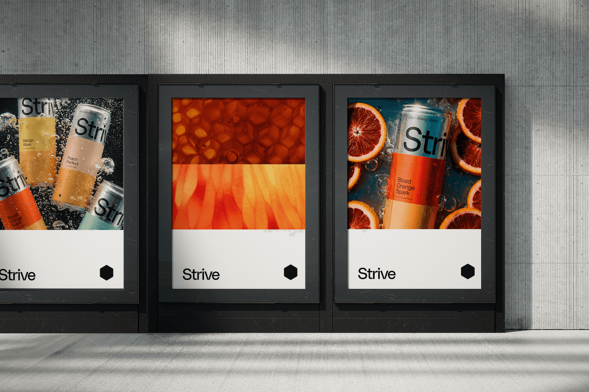
Strive is a US honey-based natural energy drink built on a simple premise: better ingredients, better energy. The category is crowded with brands competing on intensity, and most of them look the part. Strive's point of difference was its ingredient story, and the brand needed to tell it clearly without getting lost in the noise.
Strive is a US honey-based natural energy drink built on a simple premise: better ingredients, better energy. The category is crowded with brands competing on intensity, and most of them look the part. Strive's point of difference was its ingredient story, and the brand needed to tell it clearly without getting lost in the noise.

THE THINKING
THE THINKING
The honeycomb is one of nature's most efficient structures: precise, repeating, built with purpose. It became the visual foundation of the identity, not as a logo gimmick but as a genuine design system. The tiered approach to packaging came from the product itself: each drink has a distinct ingredient mix, and the visual system needed to communicate that variation while keeping the range coherent on shelf.
The honeycomb is one of nature's most efficient structures: precise, repeating, built with purpose. It became the visual foundation of the identity, not as a logo gimmick but as a genuine design system. The tiered approach to packaging came from the product itself: each drink has a distinct ingredient mix, and the visual system needed to communicate that variation while keeping the range coherent on shelf.


THE WORK
THE WORK
The result is a minimalist identity and packaging system that does a lot with very little. Each variant is immediately distinguishable, the range reads as a family, and the overall aesthetic sits apart from the visual conventions of the energy drink category. The motion work extends the system into digital, giving the brand life beyond the can.
The result is a minimalist identity and packaging system that does a lot with very little. Each variant is immediately distinguishable, the range reads as a family, and the overall aesthetic sits apart from the visual conventions of the energy drink category. The motion work extends the system into digital, giving the brand life beyond the can.

More Projects


If your brand has fallen behind your business, let's talk.

If your brand has fallen behind your business, let's talk.
If your brand has fallen behind your business, let's talk.