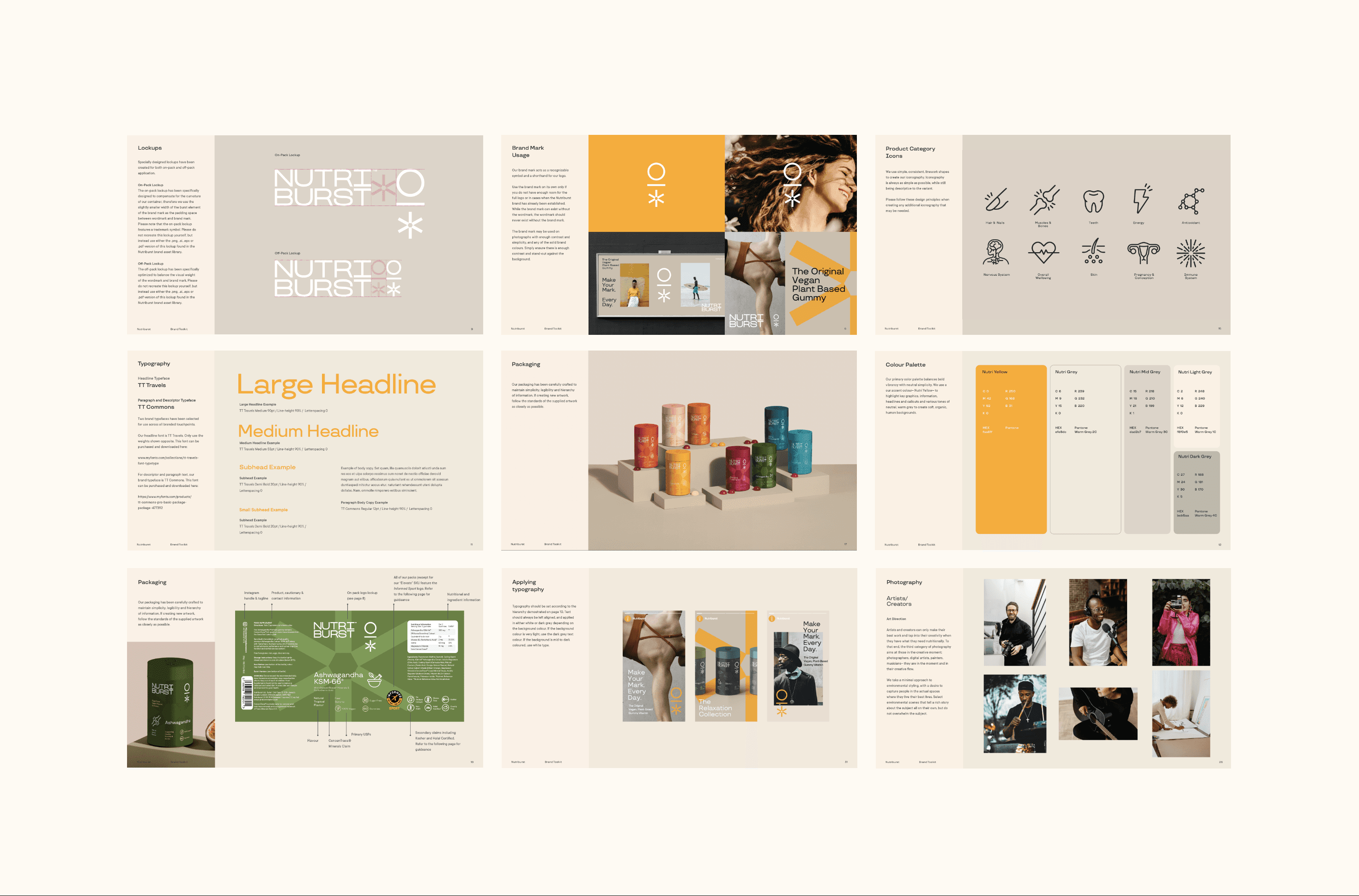
Branding
Branding
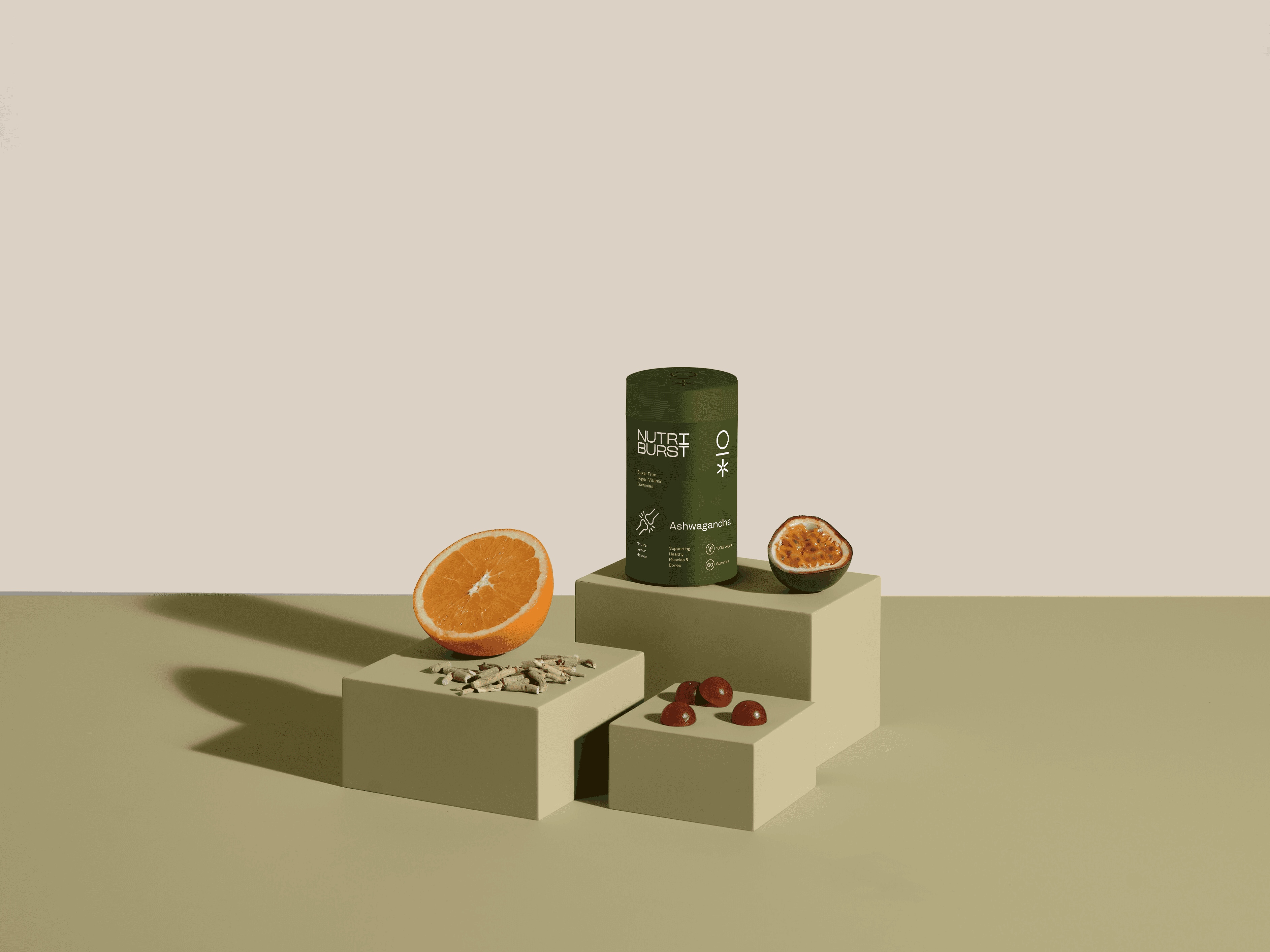
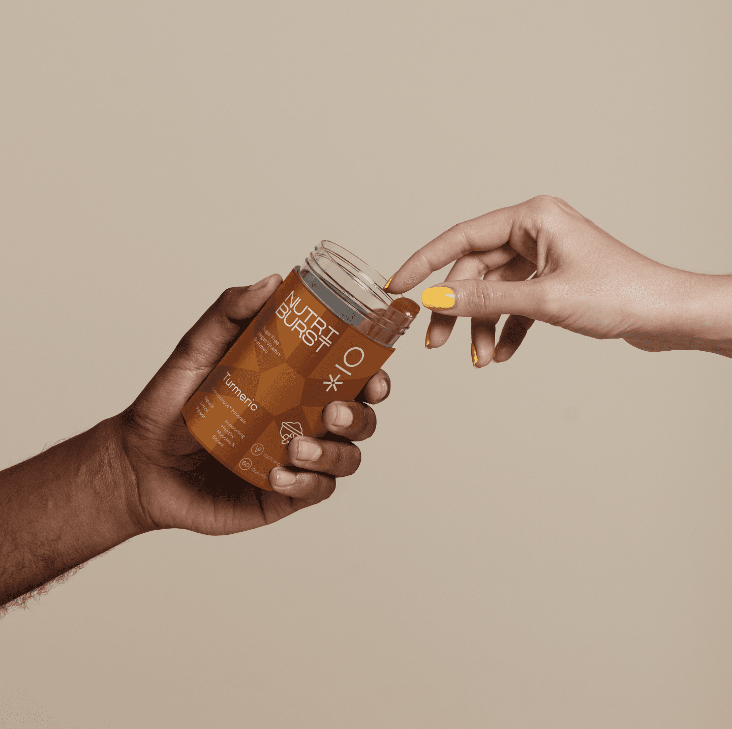
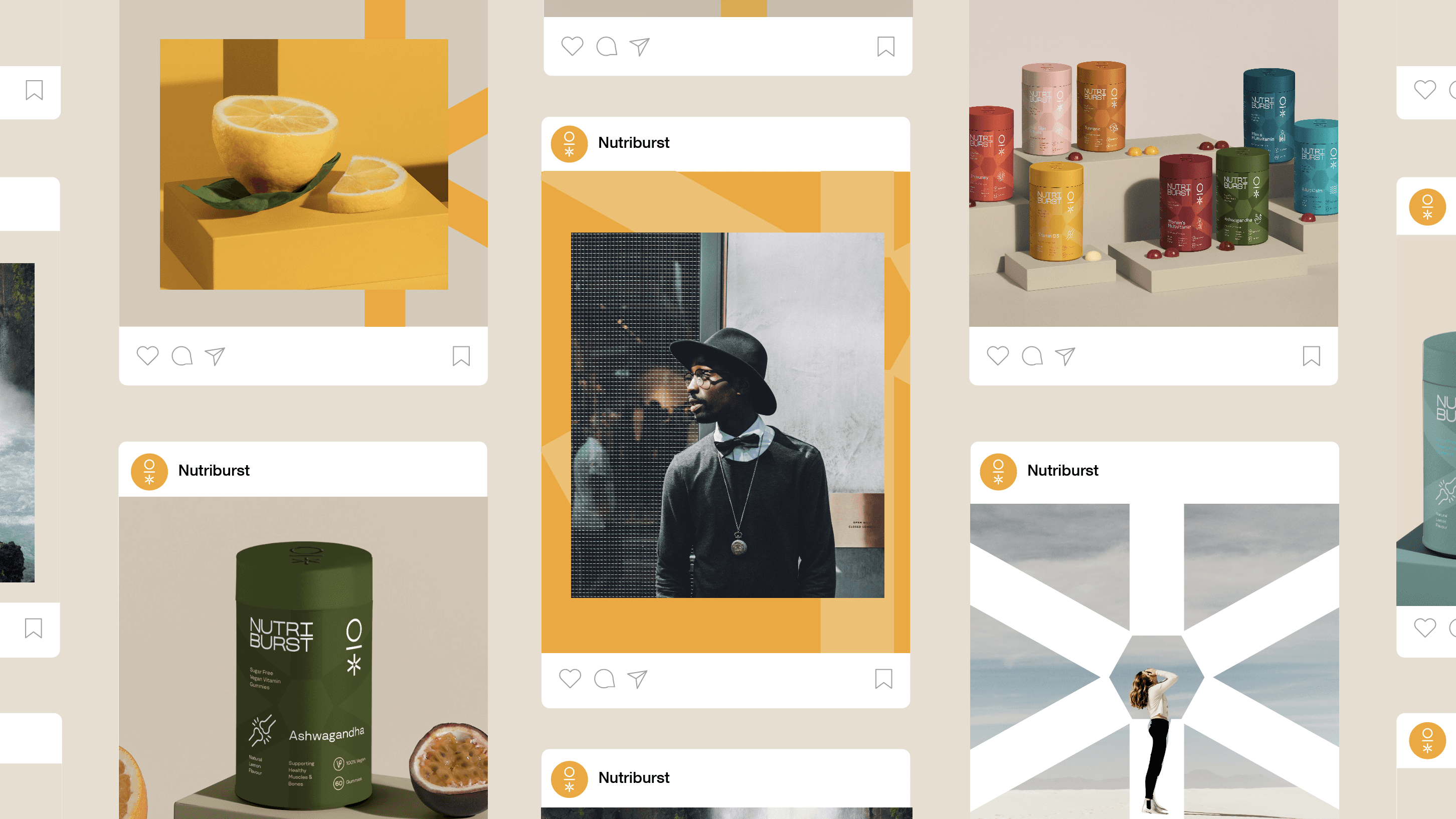
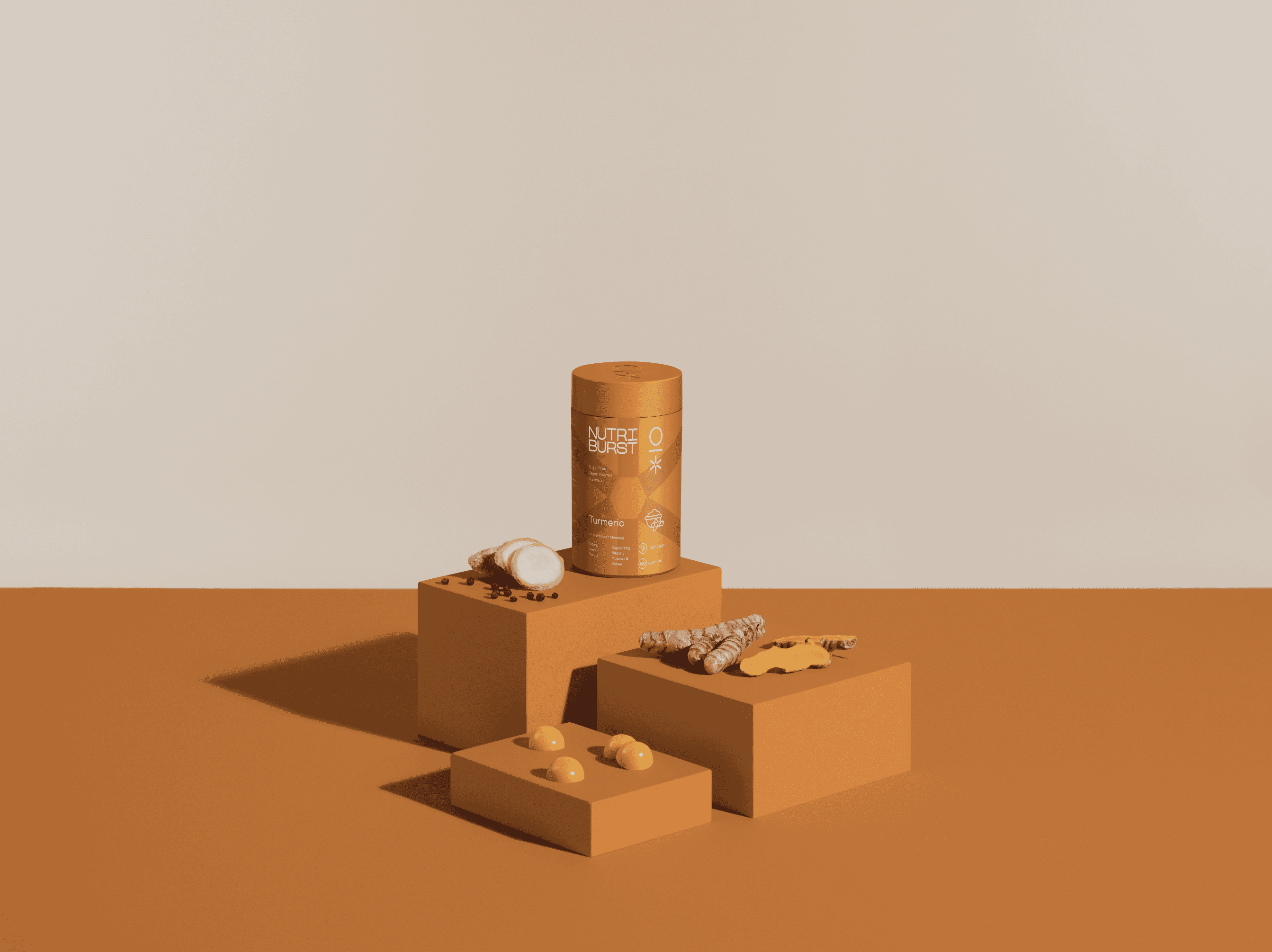
Packaging
Packaging
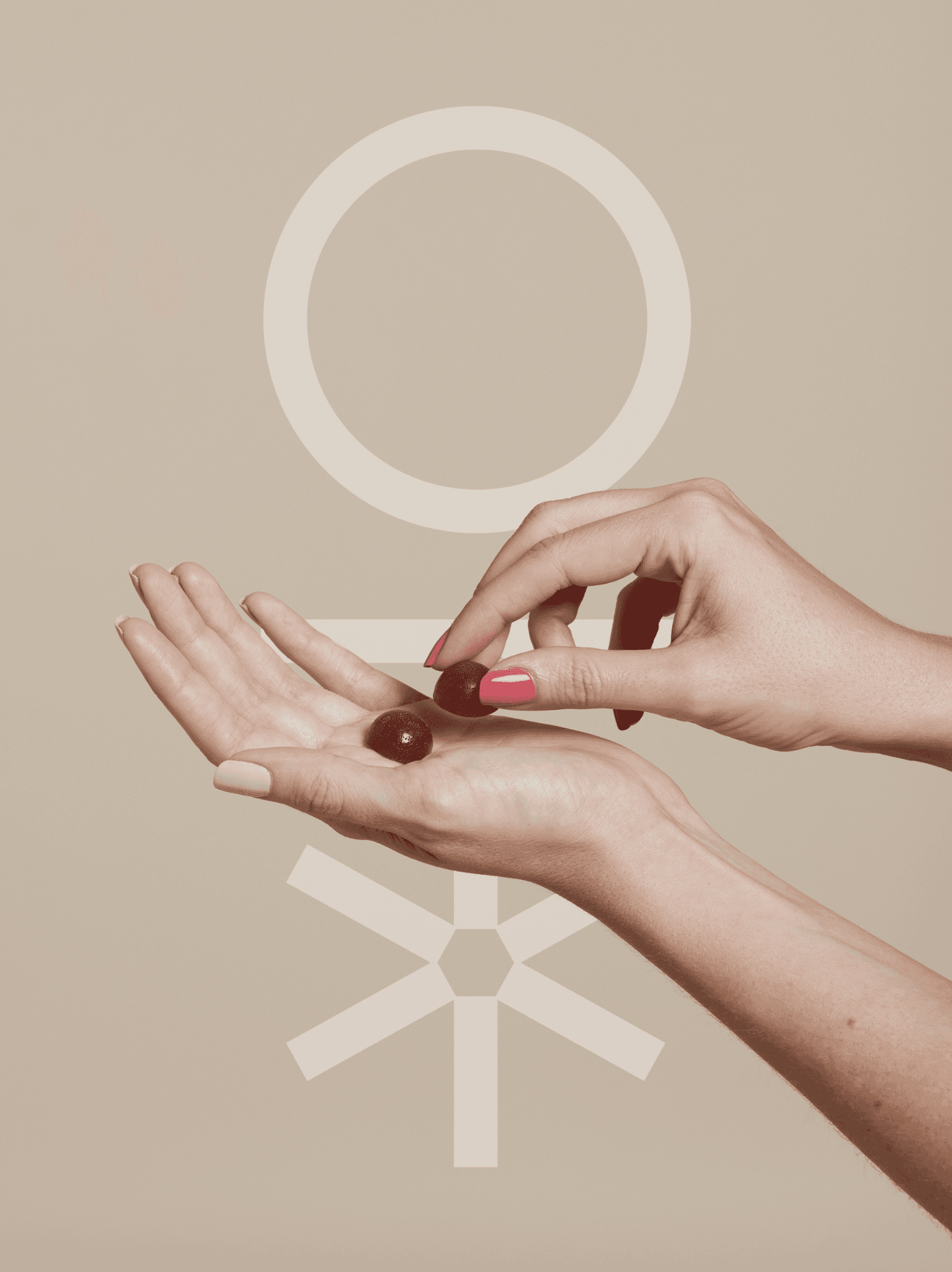
Art Direction
Art Direction
PARTNERS
PARTNERS
Kuba & Friends
Kuba & Friends
SECTOR
SECTOR
Health & Wellness
Health & Wellness
THE CONTEXT
THE CONTEXT
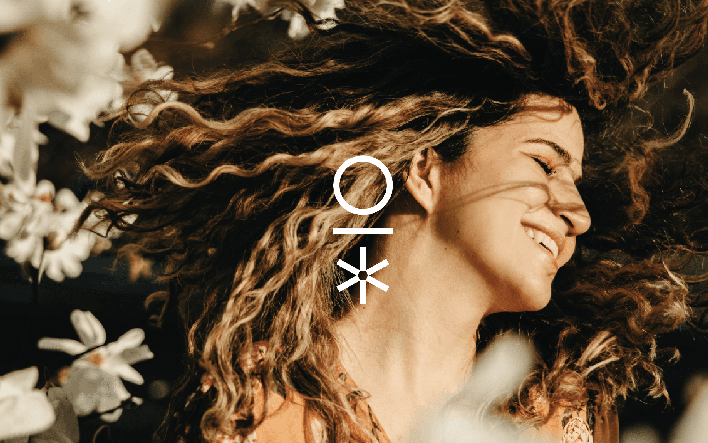
Nutriburst is one of the UK's leading vitamin gummy brands, operating in a market that has grown rapidly but where most brands still look clinical, childish, or both. The brief was to build an identity system and packaging range that felt genuinely premium: appealing to adults making considered health choices, not just parents buying for kids.
Nutriburst is one of the UK's leading vitamin gummy brands, operating in a market that has grown rapidly but where most brands still look clinical, childish, or both. The brief was to build an identity system and packaging range that felt genuinely premium: appealing to adults making considered health choices, not just parents buying for kids.

THE THINKING
THE THINKING
The tension in wellness packaging is between accessibility and credibility. Too bright and it reads as a kids' product. Too minimal and it loses the warmth the category needs. We worked to find a register that felt confident and considered, with a visual language that could carry across a wide product range without fragmenting. The photographic art direction was as important as the graphic system: the two needed to feel like they came from the same place.
The tension in wellness packaging is between accessibility and credibility. Too bright and it reads as a kids' product. Too minimal and it loses the warmth the category needs. We worked to find a register that felt confident and considered, with a visual language that could carry across a wide product range without fragmenting. The photographic art direction was as important as the graphic system: the two needed to feel like they came from the same place.
THE WORK
THE WORK
The project delivered a full identity toolkit, bespoke packaging across the range, and a curated product photoshoot. The system is built to scale: new variants slot in without needing to rebuild from scratch. For a brand with Nutriburst's distribution, consistency across dozens of SKUs is what separates a brand from a collection of products.
The project delivered a full identity toolkit, bespoke packaging across the range, and a curated product photoshoot. The system is built to scale: new variants slot in without needing to rebuild from scratch. For a brand with Nutriburst's distribution, consistency across dozens of SKUs is what separates a brand from a collection of products.
More Projects


If your brand has fallen behind your business, let's talk.

If your brand has fallen behind your business, let's talk.
If your brand has fallen behind your business, let's talk.